Zeplin's UI Kit
Empowering designers to iterate faster, easily find ❖ components, and improve xfn collaboration.
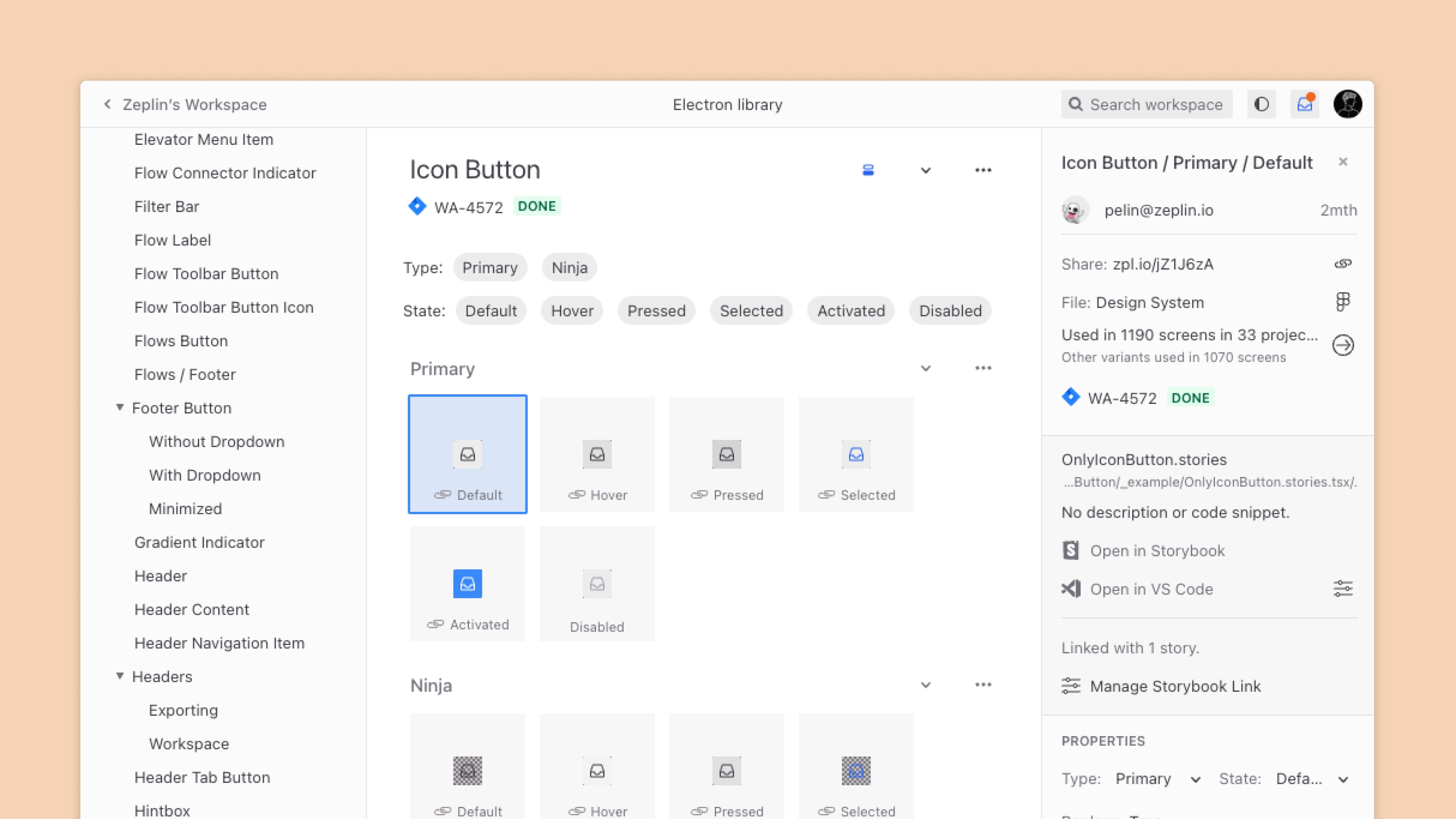
A component linked to both the Figma file and code, as seen by a developer using the Zeplin app
Problem
Till Q2 2024, Zeplin had two apps: a native MacOS app and a web app. Both apps had their own components, visual styles, and color styles spread across Sketch and Figma.
Designers had to create end-to-end mockups for each feature in both design tools, and collaborate with developers using slightly different nomenclature. We designed, developed, and tested everything twice.
Going forward, the leadership decided to continue with a single web app, and wrap it with Electron for the desktop app.
We created a single, unified component library in Figma, with the goal of building a complete design system in the coming months.
Designers looking to find components or even just screens from a certain product areas can now directly open the DS Figma file, navigate to a page, and expect to see sample screens and components there. Previously, folks had to ping the design lead requesting the source file.
Solution
This initiative halved the time spent by designers on iterating and delivering across two different design tools.
To set up our future DS work for success, the component kit was setup with all the things you'd expect:
[✔] semantic color variables,
[✔] usage guidelines,
[✔] and shared naming with code counterparts in Storybook
The designers aligned with developers on certain behaviors early on, and kept the collaboration going throughout development.
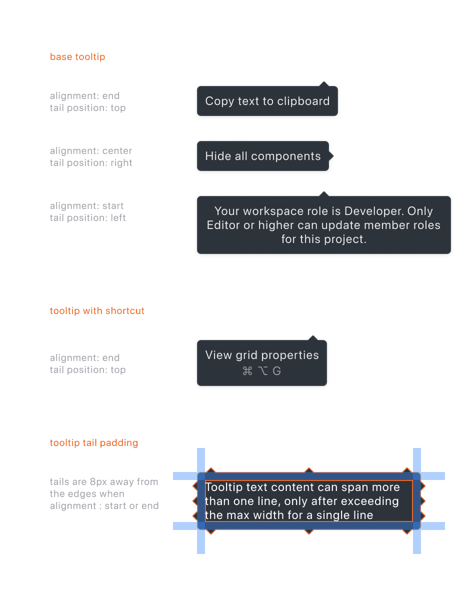
As a preview, check out some of the artifacts we made for the new Tooltip component. These guidelines are first established in Figma, baked into components. Developers then built these 'global' components with the constraints in mind and shared them back on Storybook.
[ Usage guidelines for the Tooltip component ]
Redesigning the app
Implementing the new spacing, tokens, and systems across the entire Zeplin app.
The design crew, together, redesigned the entire app with the new visual styling.
I took lead on designing UI for Project Dashboard, Inspecting Screens, Global Components, Comments, Annotations, and Search.
The redesign was primarily a visual one: making sure the app's UI felt consistent throughout. A few features were strategically revamped, with a focus on highlighting differentiation in the market, or for improving key business metrics.
Highlights from the launch of the redesigned app:
[✔] Dark Mode on both apps, made possible by semantic tokens and consistent designs
[✔] 1.5x - 7x increase in usage of differentiating features, like version diff & annotations.
[✔] Auto Layout details in Inspect mode.
[✔] Approvals, Jira tickets, & Annotations are more visible.
[✔] Easier to access version history.
dark-mode.gif
Sneak peek of the redesigned Zeplin app, launched in Q2 2024
For more details, check out the blog article covering these visual updates in a bit more detail: Zeplin's Summer Breeze 2024 Release ↗
or LinkedIn


