PROBLEM STATEMENT
PROBLEM STATEMENT
We need a visual identity for our brand that reflects our core values.
We need a visual identity for our brand that reflects our core values.
VISUAL IDENTITY | 2017 | COMISSION∑D
VISUAL IDENTITY | 2017 | COMISSION∑D
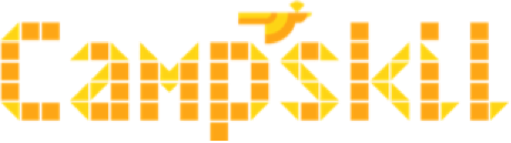
Campskil
Campskil
ABOUT THE COMPANY
Campskil is a student-run startup based in IIT-BHU that provides tailored skill development solutions by organizing events such as workshops, talks, symposia, etc.
Campskil is a student-run startup based in IIT-BHU that provides tailored skill development solutions by organizing events such as workshops, talks, symposia, etc.
DURATION
June 2017 - July 2017
TYPE OF ENGAGEMENT
Contracted as a Freelance Design Consultant
MY ROLE
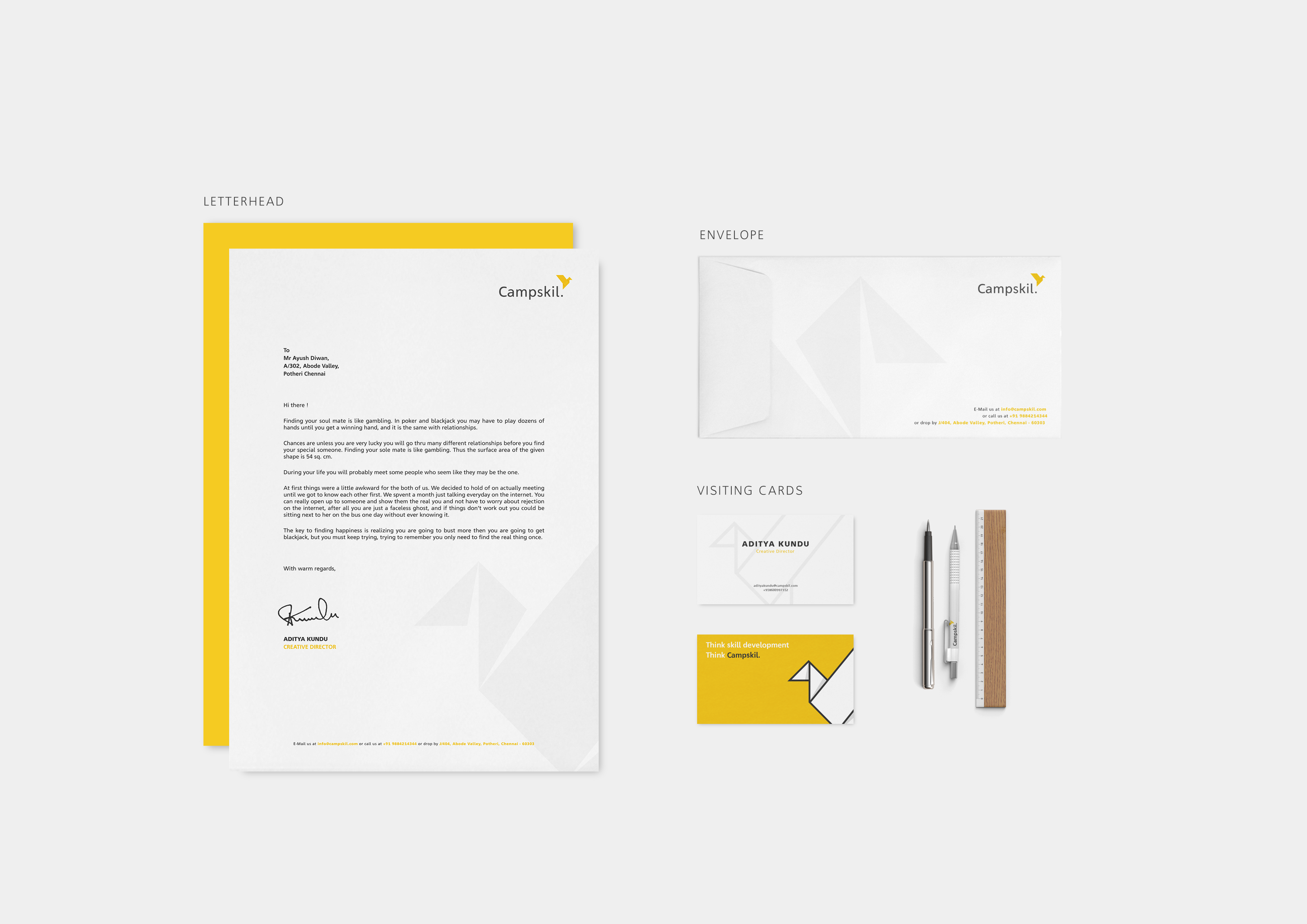
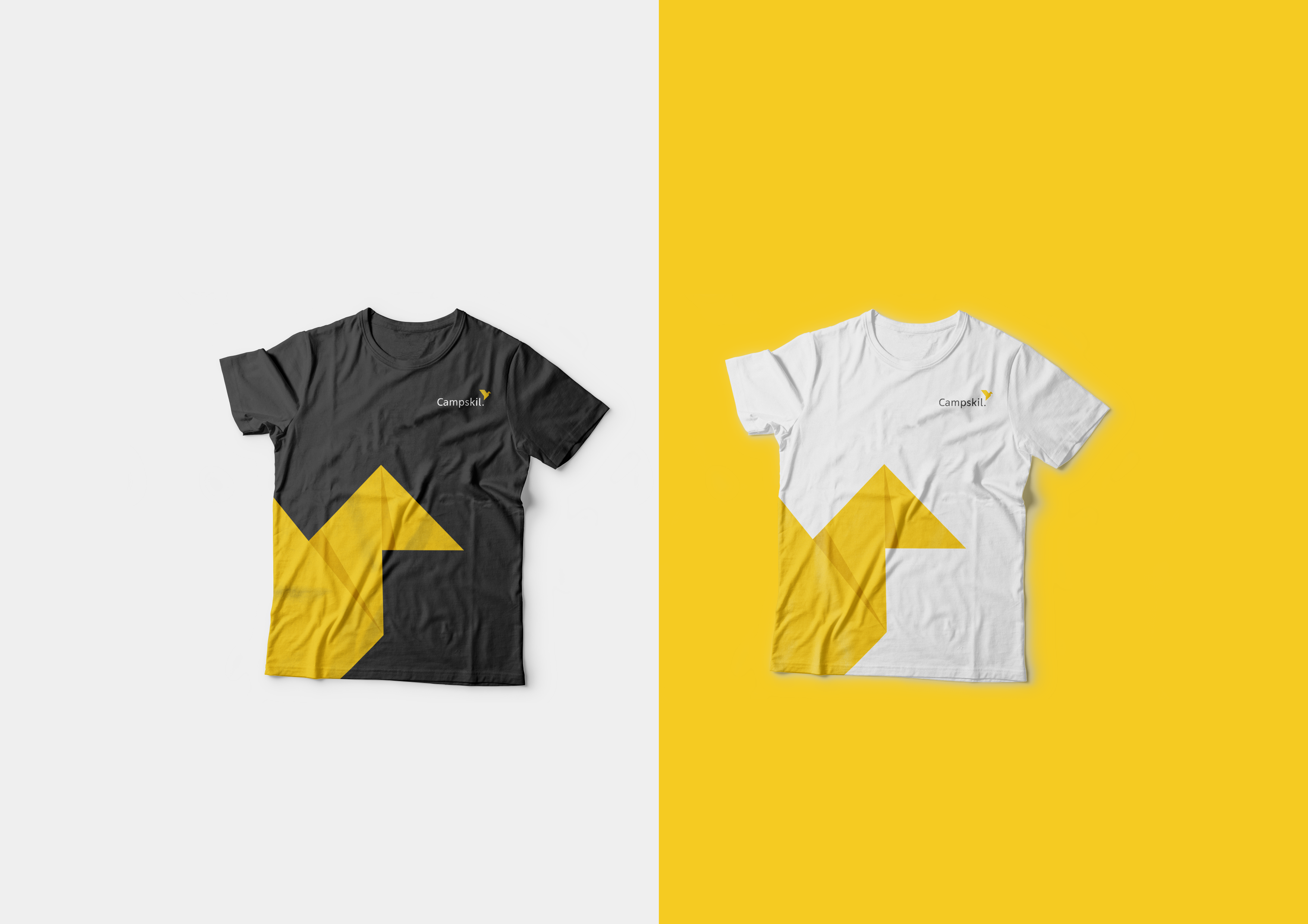
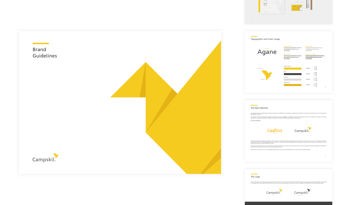
The development of a visual identity for the brand. Delivering a brand guideline document containing elements of the visual design.
UNDERSTANDING
UNDERSTANDING
The Requirements
The Requirements
Campskil felt that the existing logotype lacked appeal amongst the audience. Stakeholders were of the opinion that the current logo wasn't cohesive and versatile. They felt that a fresh visual identity that reflected the brand’s emotions was the way to go. The warm and youthful colors in the existing logo, however, were a strong factor embedded within it.

Need a brand identity that reflects their core values.

Require their brand guidelines to be documented.
They felt that their existing logo had positive elements.
The company was a fledgling startup and needed their visual identity to represent the youthfulness and the ambition of the founders. The deliverables of this project also needed to be packaged as a Brand Guideline document. This was needed since their in-house designers would use this document as a reference while designing visuals for the organization.
VALIDATING
The Vision
The Vision
During initial interviews with the stakeholders within the company, it became known that they would like Campskil to represent youth and freedom. These two emotions formulated the core ethos of the company. While conceptualizing solutions, the insights gained from the interviews were used to help forge and validate the core elements of the redesign.
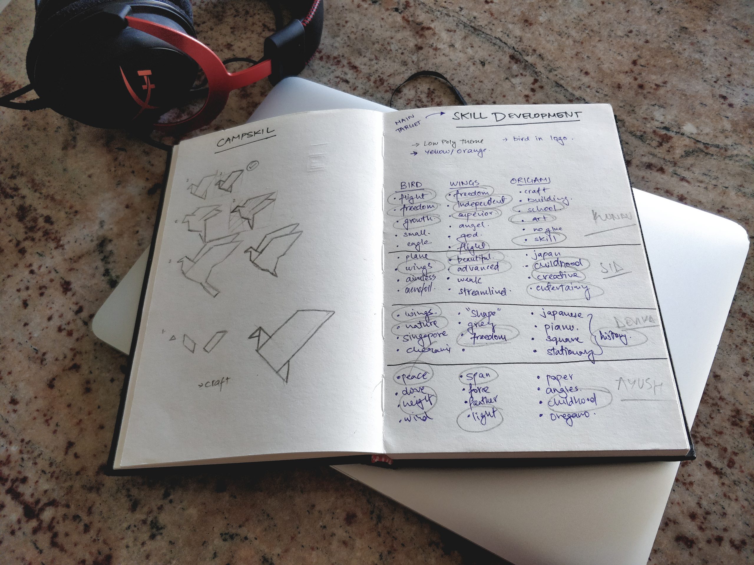
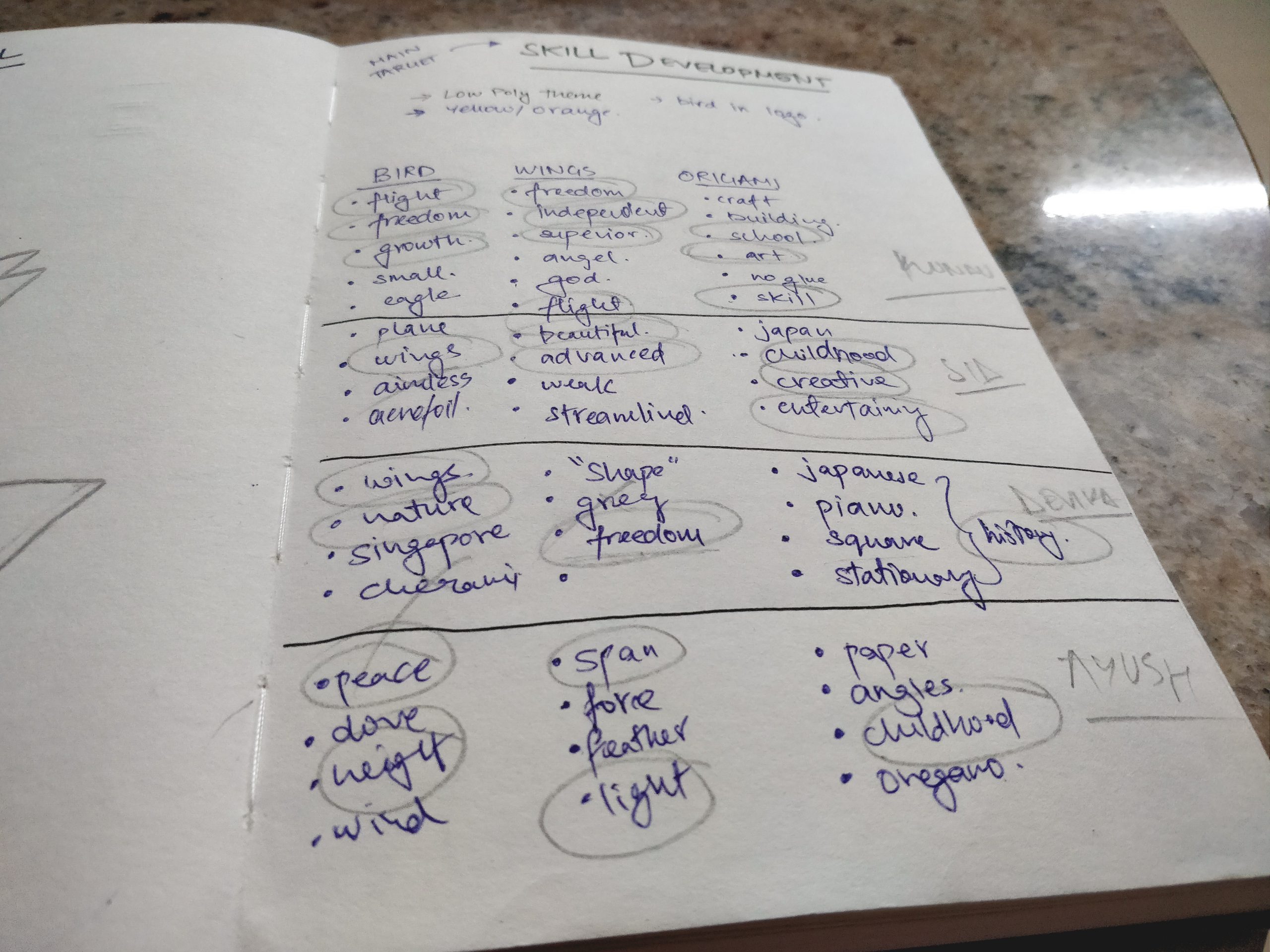
People were asked to describe the emotions or memories that were evoked by the ‘target words’ of the identity in development.
Target Words:
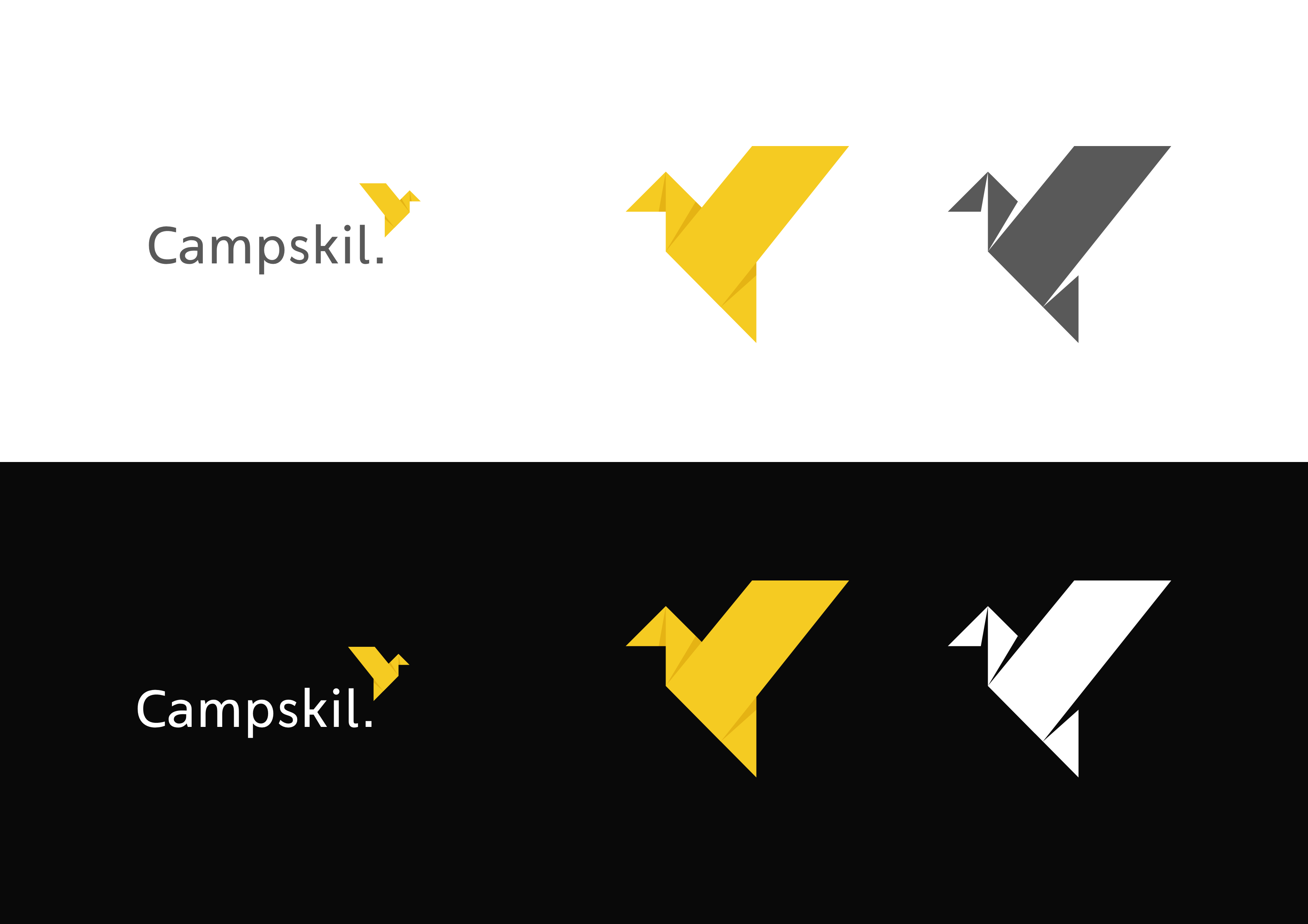
Birds, Wings, and Origami
Target Words:
Birds, Wings, and Origami
Over half the people interviewed linked the target words to freedom and independence. Also, 80% of them said that origami reminds them about childhood. This validation of user empathy was taken forward into early sketches and the formulation of the identity.

linked one of the three target words to freedom.

linked the target word 'Origami' to childhood.
DELIVERING
The Result
The Result

The redesign of the visual identity of Campskil started with one word, Freedom. The freedom to explore. The freedom to learn. The freedom to innovate. At it’s heart, Campskil is a company that enables individuals to develop skills that are not bound by textbooks or curriculum.

QUOTED FROM THE CAMPSKIL BRAND GUIDELINES:
QUOTED FROM THE CAMPSKIL BRAND GUIDELINES:
The origami shaped “Rising Bird” symbolizes a free mind that is taking off to explore new opportunities that await in the journey of one’s life. The origami-style of the logo is reminiscent of our childhood days whereby using a 6”x 6” origami sheet we were asked to let our creativity run wild and try to create all sorts of shapes. The thrill of exploring new paths is what motivates this logo.
The origami shaped “Rising Bird” symbolizes a free mind that is taking off to explore new opportunities that await in the journey of one’s life. The origami-style of the logo is reminiscent of our childhood days whereby using a 6”x 6” origami sheet we were asked to let our creativity run wild and try to create all sorts of shapes. The thrill of exploring new paths is what motivates this logo.
To know more about the inspiration behind the origami bird, reach out to me at kundu@gatech.edu.
CONNECT WITH ME ON [LINKEDIN] [INSTAGRAM]
[1] ∑ASTER ∑GGS ON THIS PAGE